Why Small Businesses Need a Mobile-First Website in 2026
For many businesses, most visitors now arrive on a phone. If your website wasn't designed mobile-first, you may be losing customers before they read your first sentence.
Graphxify Team
3 min read
The Mobile Reality
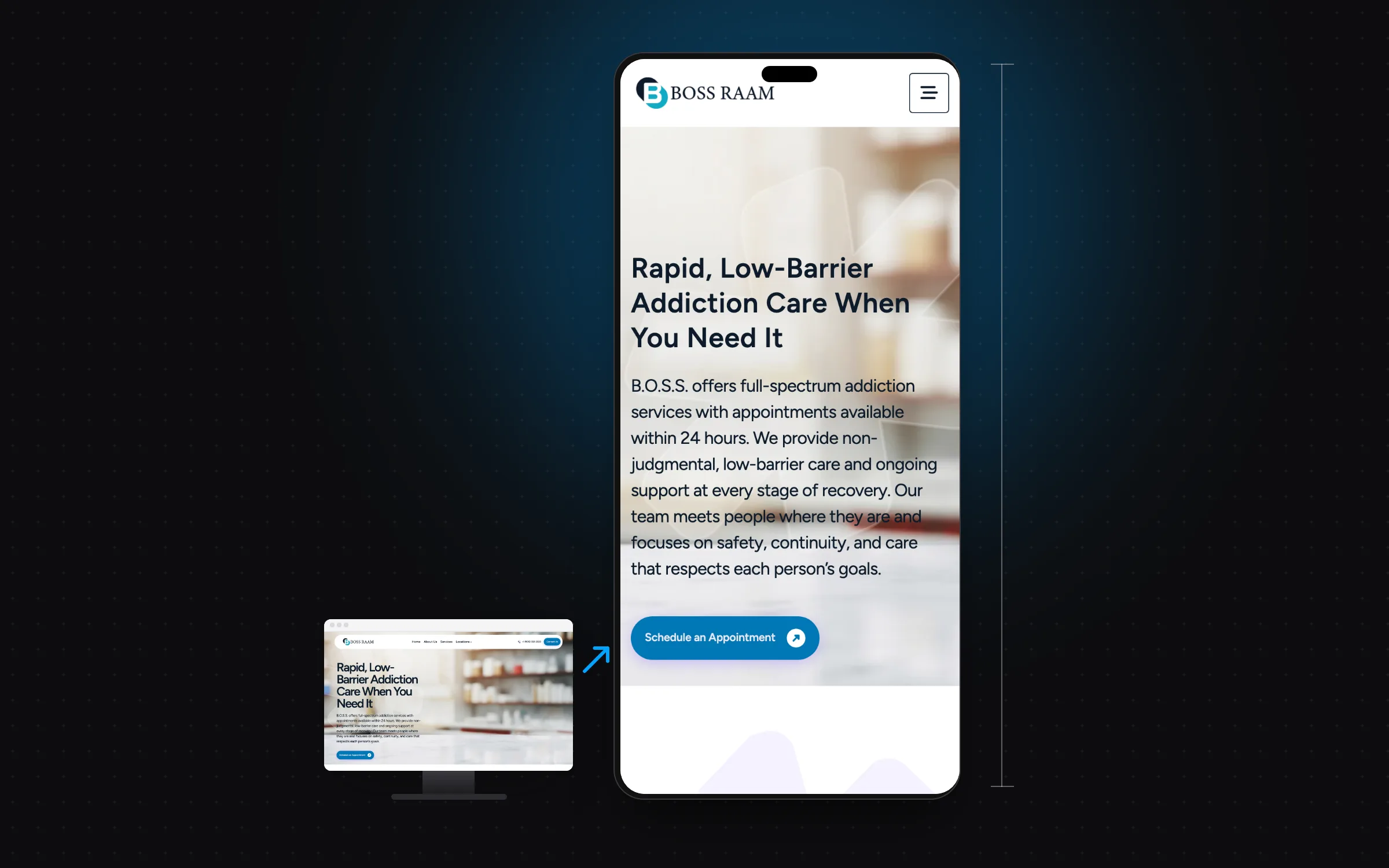
For many businesses, most visitors now arrive on a phone — your own analytics will show your exact split. Local searches such as "restaurant near me," "web designer near me," or "best dentist in my area" are often made on the go.
If your website was built five or more years ago, it was likely designed desktop-first, then adapted (poorly) for mobile. In 2026, that approach is a liability.
What Mobile-First Actually Means
Mobile-first design isn't just making a website "work" on a small screen. It means designing for the smallest, most constrained context first — then expanding for larger screens. The result is:
- Faster load times (mobile networks are slower; every kilobyte matters)
- Cleaner layouts that tend to work better at every screen size
- A stronger foundation for search (Google uses the mobile version of your site for indexing and ranking)
How Google Ranks Mobile Performance
Google uses mobile-first indexing: it uses the mobile version of a site's content, crawled with its smartphone agent, for indexing and ranking. In practice, the mobile version of your site is the one Google evaluates. Core Web Vitals — Google's user-experience metrics — are reported separately for mobile and desktop.
The three Core Web Vitals and Google's "good" thresholds:
- Largest Contentful Paint (LCP): How fast your main content loads (target: under 2.5 seconds)
- Interaction to Next Paint (INP): How quickly the page responds to taps and clicks (target: under 200ms)
- Cumulative Layout Shift (CLS): How stable your layout is as it loads (target: under 0.1)
Common Mobile Problems on Business Websites
Unreadable Text
Body text smaller than 16px is often hard to read on a phone without zooming. Yet many older business websites still use 12px or 14px body text, which can push visitors — especially older ones — to leave.
Buttons That Are Too Small to Tap
Apple's Human Interface Guidelines recommend touch targets of at least 44×44 points. Many websites have "Contact Us" buttons that are much smaller. A missed tap can easily mean a missed inquiry.
Images That Slow Everything Down
High-resolution desktop images served on mobile connections can slow load times dramatically. A proper mobile-first approach uses responsive images — serving appropriately sized images based on the device — and modern formats like WebP.
No Click-to-Call
For local businesses everywhere, the phone is still how many deals get closed. If your phone number isn't a tappable link on mobile, you're adding unnecessary friction.
What to Do About It
If your current website has mobile problems, you have two paths:
- Patch it — Quick fixes to the worst issues (button sizes, font sizes, images). Lower cost, but often leaves underlying structural problems.
- Rebuild it properly — A mobile-first rebuild on a modern framework usually delivers better long-term results. It's often the better choice if your website is more than 3–4 years old or was never properly designed for mobile.
"The best time to build a mobile-first website was 2019. The second best time is right now." — Graphxify Team
The Business Case for Investing Now
Consumers have high expectations. When they land on a slow, hard-to-use mobile site, they often leave — and go to a competitor who invested in their digital presence. In competitive markets, where nearly every industry is crowded, your website is a differentiator.
A professionally designed, mobile-first website isn't a luxury for established brands. It's table stakes for any business that wants to grow in 2026.
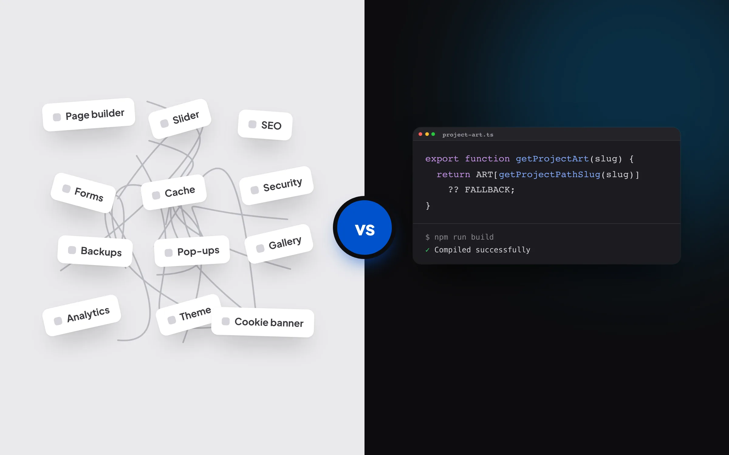
If you're weighing whether to patch your current site or rebuild properly, our guide on custom web development vs. WordPress walks through the technical decision in detail.
Get a Mobile-First Website That Performs
Graphxify builds high-performance, mobile-first websites for businesses worldwide from the ground up — no WordPress templates, no shortcuts. If your current site is holding your business back, let's talk about what a proper rebuild would look like for you.